Space-mission-global-trend
🚀 Space Mission Analysis Dashboard (Power BI)
Project Overview
This project analyzes global space missions using an interactive Power BI dashboard to uncover trends in rocket launches, mission success rates, and country-level space activity.
The goal of the analysis is to understand patterns in historical space missions and answer key questions such as:
- How have rocket launches evolved over time?
- Which countries conduct the most successful missions?
- Which rockets have been used most frequently?
- Where are most space launches conducted?
- What percentage of missions succeed or fail?
The dashboard transforms historical mission data into visual insights that highlight the development and competitiveness of the global space industry.
🛠 Tools Used
- Power BI
- Data visualization
- Data transformation
- Analytical storytelling
🧠 Skills Demonstrated
This project demonstrates several Power BI and data analysis skills, including:
- Data cleaning and preparation
- Interactive dashboard design
- Data visualization best practices
- Time-series analysis
- Comparative analysis across countries
- Insight generation from historical datasets
🛠️ Data Transformation (The ETL Process)
The raw dataset required significant preparation before it could be used for visualization. Below is a comparison of the data before and after the cleaning process in Power Query.
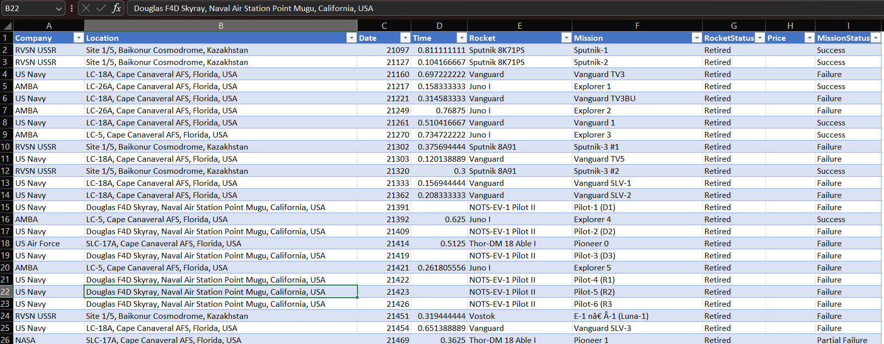
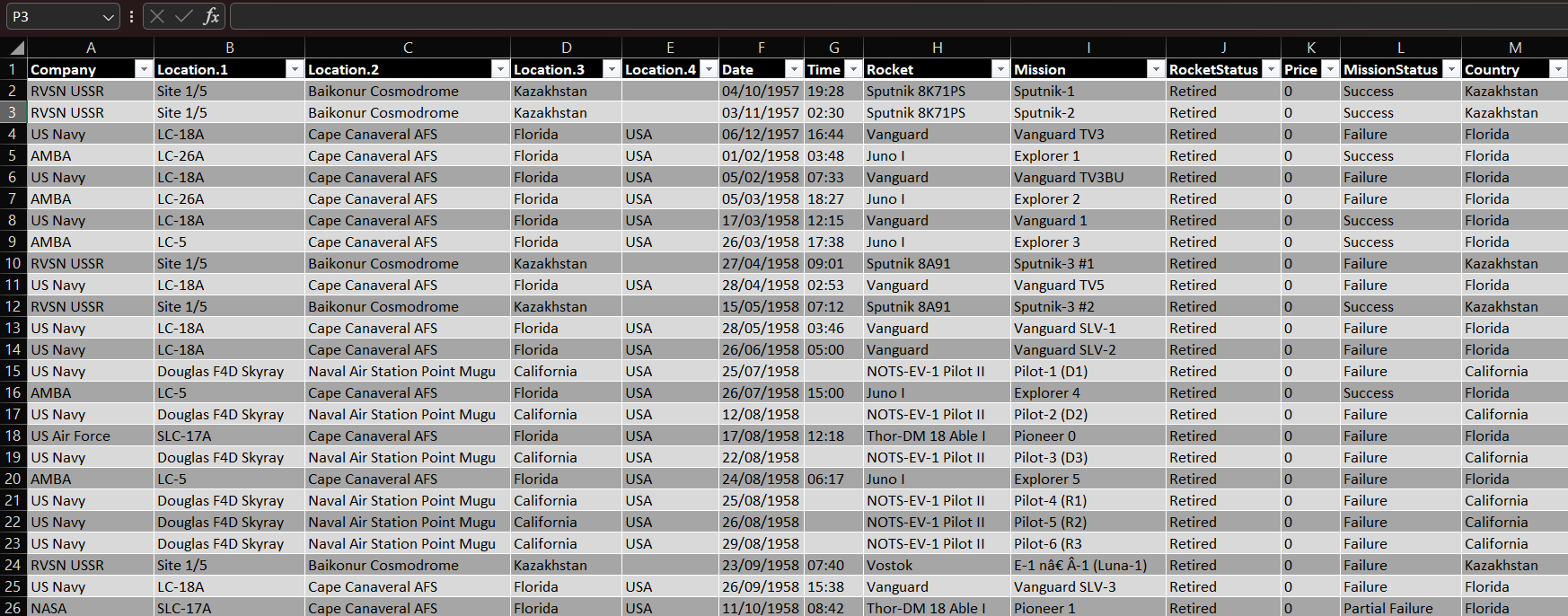
🔍 Data Cleaning: Before vs. After
Before Cleaning
After Cleaning
Key Challenges & Solutions:
- Messy Location Strings: Launch sites were stored as single strings (Site, Base, State, Country). I used Split Column by Delimiter in Power Query to isolate the Country for geographical analysis.
- Invalid Date Formats: Raw dates were stored as serial integers (e.g., 21097). I transformed these into a standard DD/MM/YYYY format to enable time-series trends.
- Time Serialization: Mission times were recorded as decimal values (e.g., 0.811). I converted these into a proper HH:MM time format (19:28).
- Data Imputation: Standardized the
Pricecolumn by handling null values and converting them to a currency data type to maintain model integrity.
📊 Dashboard Features
The dashboard contains several visualizations that explore different aspects of space missions.
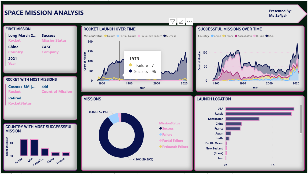
1️⃣ Rocket Launch Over Time
This line chart tracks the number of rocket launches per year, categorized by mission outcome:
- Success
- Failure
- Partial Failure
- Prelaunch Failure
Analysis
The visualization shows how rocket launches have increased significantly over the decades.
Insights
- Rocket launches increased steadily from the 1960s during the space race.
- Launch activity declined slightly after the Cold War period.
- In recent years, launch frequency has increased again due to renewed global space activity and private space companies.
- The majority of missions result in successful launches, indicating improved technology and mission reliability.
2️⃣ Successful Missions Over Time by Country
This area chart compares successful missions across major spacefaring nations.
Countries included:
- USA
- Russia
- China
- France
- Kazakhstan
Analysis
The chart shows how mission success has evolved by country over time.
Insights
- The USA and Russia dominate the early years of space exploration.
- China shows strong growth in successful missions in more recent years.
- France and Kazakhstan contribute fewer missions but still maintain active participation in global launches.
- The growth of successful launches suggests continuous technological advancement in the space industry.
3️⃣ Rocket With the Most Missions
This visual highlights the rocket that has been used for the largest number of missions.
Key Finding
- Cosmos-3M recorded the highest number of missions (446 launches).
Insight
- The frequent use of this rocket suggests high reliability and long-term operational use.
4️⃣ Country With the Most Successful Missions
This bar chart compares the number of successful missions by country.
Insights
- Russia and the USA lead global space missions, reflecting their long history in space exploration.
- Kazakhstan appears prominently.
- China has grown rapidly in recent decades.
5️⃣ Mission Outcome Distribution
This donut chart shows the percentage distribution of mission outcomes.
Mission categories include:
- Success
- Failure
- Partial Failure
- Prelaunch Failure
Insights
- Approximately 89.9% of missions are successful, indicating high reliability in modern space missions.
- Failures represent a small but important portion, reflecting the risks involved in space exploration.
- Partial failures and prelaunch failures occur less frequently but still contribute to operational challenges.
6️⃣ Launch Locations
This bar chart shows the number of launches by location.
Insights
- The USA and Russia host the largest number of launch sites.
- Kazakhstan is also a major launch hub due to the Baikonur Cosmodrome, one of the world’s most historic launch facilities.
- Other countries such as China, France, and Japan also contribute to global launch activity.
📈 Key Takeaways
From the analysis, several patterns emerge:
- The space industry has grown significantly over time, especially after the early space race period.
- Mission success rates are very high, reflecting improved engineering and testing processes.
- The USA, Russia, and China dominate global space missions.
- Some rockets have achieved long operational lifespans and high launch counts, demonstrating reliability.
- Global interest in space exploration continues to grow, driven by both government agencies and private companies.
👩💻 Author
Ms_Safiyah
Data analysis project created using Power BI to explore historical space mission data and visualize global space activity.